
Understanding Retina Displays
Retina displays have changed everything. Apple’s marketing term stuck because it describes something real — pixel density so high that the human eye can’t distinguish individual pixels at normal viewing distance. Most modern devices fall into this category now. Your phone, tablet, even some laptops have displays with pixel ratios of 2x, 3x, or higher.
This matters because a standard image at 72 DPI looks soft on these screens. You’re not providing enough pixel information. The device has to guess and fill in the blanks, which degrades quality. That’s why photographers need to think differently about image preparation. You can’t just export at standard web resolution and expect crisp results.
Resolution Requirements
For retina displays, you’re essentially working with a 2:1 ratio. A display showing 1920×1080 pixels might actually have 3840×2160 physical pixels. Your images need to match this density.
- Standard web: 72 DPI (1x pixel ratio)
- Retina 2x: 144 DPI or double dimensions
- High-end retina: 192+ DPI or triple dimensions
- Print: 300 DPI minimum, 600 DPI ideal
The practical approach? Export at 2x the display size you’re targeting. If your design calls for a 1000-pixel-wide image on desktop, export at 2000 pixels. The browser scales it down, but now you’ve got pixel density to spare.
Key insight: File size matters less than clarity. A 500KB image at 2x resolution looks better than a 200KB image at standard resolution. Users notice sharpness first.
File Format Selection
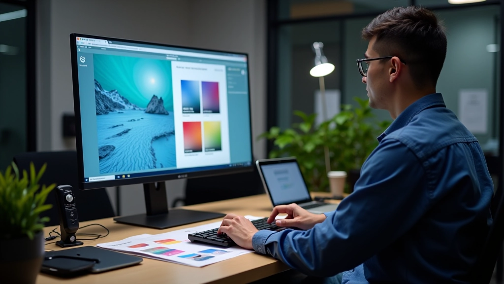
You’ve got choices here, and they’re not all equal. Each format makes trade-offs between quality, file size, and compatibility. For photography, you’re primarily working with three options — and each has specific use cases.
JPEG remains the standard for photographs because it compresses really well. A high-quality JPEG (80-85 quality setting) preserves detail while keeping file size reasonable. We’re talking 2-3x smaller than PNG for the same visual content. It’s perfect for screen display where you can’t see compression artifacts at normal viewing distance.

Format Comparison
WebP is newer and better. It’s about 25-30% smaller than JPEG at the same quality level. Browser support is now solid — everything except older Internet Explorer handles it fine. If you’re optimizing for web only, WebP is your move. Export both JPEG and WebP, then use the picture element to serve WebP to modern browsers and JPEG as fallback.
PNG works best for graphics, screenshots, or images with transparency. For photographs, PNG files blow up to 3-4x JPEG size. You don’t need lossless compression for photo work. Save your PNG exports for when you actually need them.
This guide covers technical optimization for digital and print media. Actual results depend on your specific equipment, software, and intended use. Always test on your target devices before finalizing assets for production. Different monitors, phones, and printers will display colors and sharpness differently based on their calibration and specifications.
Colour Profiles and Management
This is where most photographers stumble. You edit your images in Adobe RGB or ProPhoto, which have wider colour ranges than what screens can display. When you export for web without the right colour profile, your beautiful saturated reds become muddy orange. Your greens shift toward yellow. It’s maddening because your monitor looked perfect.
The solution is colour profile embedding. For web, convert to sRGB before exporting. sRGB is the standard colour space for screens. It’s smaller than what you’re working in, but it’s consistent across browsers and devices. Most modern browsers display sRGB correctly without any special handling.
For print, it’s different. You’ll want to work in a print-specific profile provided by your printer — often something like ISO Coated v2 or a custom profile they’ve created. These profiles account for how ink behaves on paper. You’re not working smaller like you do for sRGB. You’re working with a different colour system altogether.
Practical Steps
In Lightroom or Capture One, you’ve probably noticed export options for colour space. Choose sRGB for any screen delivery. For print, select the profile your printer recommends, or ask them what they use. Many print labs provide downloadable ICC profiles.
Embed the profile in your file. This tells the receiving application which colour space you’re using. Don’t assume the viewer will interpret your colours correctly without this information. It’s a small step that prevents major headaches.
Preparing for Print
Print preparation requires thinking about several things you don’t worry about for screens. Resolution is the first — 300 DPI is the minimum for acceptable print quality. 600 DPI is ideal if you’re doing fine art or large format. This means your actual pixel dimensions need to be much larger than screen work.
Colour mode matters too. Print uses CMYK (Cyan, Magenta, Yellow, Black), while screens use RGB (Red, Green, Blue). These colour spaces don’t map perfectly to each other. Some colours that look vibrant on screen can’t be reproduced in print. Your print vendor should convert to CMYK, but it’s good to understand the limitations.
Sharpening is different for print. You don’t need as much because print resolution is so much higher. Oversharpen for print and you’ll see haloes around edges. Start conservative — you can always add more. Unsharp Mask with radius 0.5-1.0 pixels and amount 100-150% works well for most prints. Test on a small print first.
Print Preparation Checklist
- 1 Verify image dimensions at 300 DPI meet your print size requirements
- 2 Apply subtle sharpening (Unsharp Mask with conservative settings)
- 3 Convert to CMYK using printer’s profile or sRGB as fallback
- 4 Embed the colour profile in your export
- 5 Order a test print to verify colour and sharpness before full production
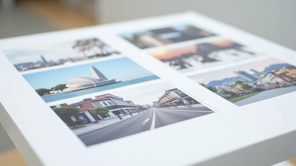
Test Prints Matter
Don’t skip test prints. Your monitor, even if it’s calibrated, won’t show you exactly how colours will look on paper. Different papers have different characteristics — glossy papers make colours pop, matte papers are more subdued, fine art papers add texture.
Order a small batch first. Look at them in natural light, in your studio light, in evening light. This is how your client will see them. If something’s off, you’ve only printed a few copies. Much better than discovering issues after printing 500 copies for an exhibition.
Web Optimization Essentials
For web delivery, you’re optimizing for speed and quality balance. Massive files slow down page loads. Users abandon slow sites. You’re aiming for files that look sharp but don’t punish bandwidth.
Export your 2x resolution images, then compress them. Use your software’s quality slider — for JPEG, 80-85 quality is sweet spot for photography. For WebP, you can go slightly lower quality (75-80) because the format compresses more efficiently. The visual difference between 85 and 75 quality is barely noticeable, but the file size difference is significant.
Consider responsive images. Deliver different sizes for different devices. A mobile phone doesn’t need a 2000-pixel-wide image. Deliver 1000 pixels for mobile, 2000 for desktop. This isn’t complicated — modern image optimization tools handle it automatically.
The difference between a crisp image and a soft one isn’t always obvious until you see them side by side. That’s why optimization matters — it’s the difference between professional and amateur.
Wrapping It Up
Image optimization isn’t glamorous, but it’s essential. Your photography deserves to look as good as possible wherever it’s displayed. That means understanding your target — is this for screen or print? Who’s viewing it? What device are they using? What’s their internet speed?
Once you’ve got a workflow established, it becomes automatic. You’ll export at 2x resolution for web, convert to sRGB, compress to JPEG or WebP, and you’re done. For print, you’ll check DPI, embed the colour profile, apply subtle sharpening, and order test prints. These steps take minutes, but they make the difference between work that looks good and work that looks professional.
Start implementing these techniques on your next project. You’ll notice the difference immediately.